Single Line Text
Single Line Text fields perfectly accommodate short answer user responses. User Information Fields pre-generated using the Single Line Text field include First Name, Last Name, Address, City, Zip, Email, and Phone fields.
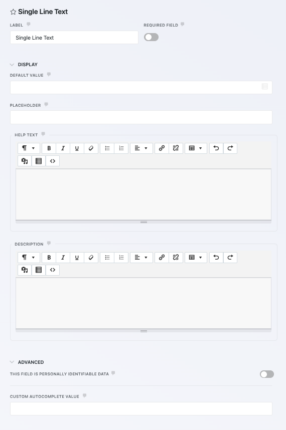
General Settings
- Label
- The name of the field as displayed to your users.
- Required Field
- If enabled, this field must be completed before the form can be submitted.
Display Settings
- Default Value
- The field will load pre-populated with text entered as the Default Value. This setting supports merge tags to display unique or custom values.
- Placeholder
- Text entered here will appear when the form loads, but disappear when the user starts typing.
- Description
- Any text entered here will appear between the label and the field.
Paragraph Text
The Paragraph field perfectly accommodates longer user responses that won’t fit in a Single Line Text field, and offers a rich text editor for the user if desired for formatting.
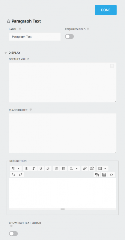
General Settings
- Label
- The name of the field as displayed to your users.
- Required Field
- If enabled, this field must be completed before the form can be submitted.
Display Settings
- Default Value
- The field will load pre-populated with text entered as the Default Value. This setting supports merge tags to display unique or custom values.
- Placeholder
- Text entered here will appear when the form loads, but disappear when the user starts typing.
- Description
- Any text entered here will appear between the label and the field.
- Show Rich Text Editor
- If enabled, a rich text editor will be provided for the user to format their responses in this field. Off by default.
Radio List
The Radio List field presents options from which a user can make a single selection only.
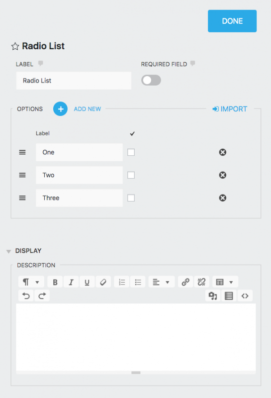
View the step-by-step tutorial here.
General Settings
- Label
- The name of the field as displayed to your users.
- Required Field
- If enabled, this field must be completed before the form can be submitted.
- Options
-
The options and values for the fields.
- Add New
- Adds another option to the list.
- Label
- The name of the list option displayed to the user.
- Calc Value
- When including this field in a calculation, the value entered here will be entered as a part of that calculation if the given list option is selected.
- “Check” column
- Whichever list option checked here will display as the default option to the user.
Display Settings
- Help Text
- Entering text here will display an informational icon next to the field label. When a user hovers over it, a small window will appear containing this text.
- Description
- Any text entered here will appear between the label and the field.
Select
The Select field is a list field that allows for one selection by the user from a drop-down. User Information Fields pre-generated using the Select field include Country and US States.
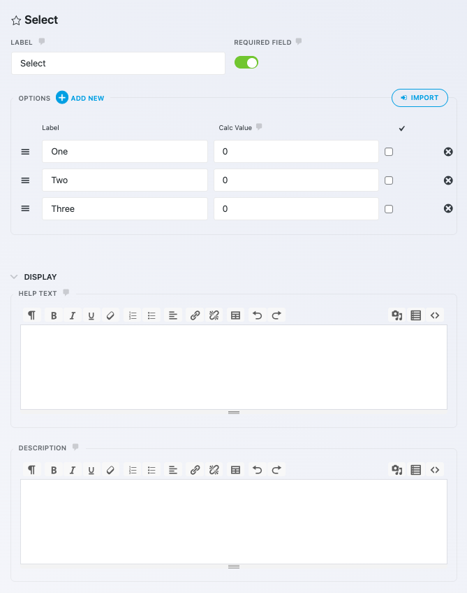
View the step-by-step tutorial here.
General Settings
- Label
- The name of the field as displayed to your users.
- Required Field
- If enabled, this field must be completed before the form can be submitted.
- Options
-
The options and values for the fields.
- Add New
- Adds another option to the list.
- Label
- The name of the list option displayed to the user.
- Calc Value
- When including this field in a calculation, the value entered here will be entered as a part of that calculation if the given list option is selected.
- “Check” column
- Whichever list option checked here will display as the default option to the user.
Display Settings
- Help Text
- Entering text here will display an informational icon next to the field label. When a user hovers over it, a small window will appear containing this text.
- Description
- Any text entered here will appear between the label and the field.
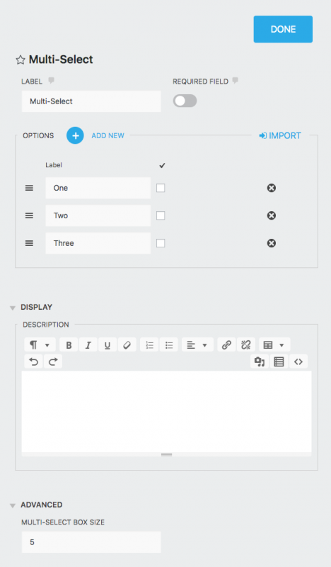
Multi-Select
The Multi-Select field is a list field that allows for 2 or more selections by the user from a drop-down (CMD+click or CTRL+click to make multiple selections).
View the step-by-step tutorial here.
General Settings
- Label
- The name of the field as displayed to your users.
- Required Field
- If enabled, this field must be completed before the form can be submitted.
- Options
-
The options and values for the fields.
- Add New
- Adds another option to the list.
- Label
- The name of the list option displayed to the user.
- Calc Value
- When including this field in a calculation, the value entered here will be entered as a part of that calculation if the given list option is selected.
- “Check” column
- Whichever list option checked here will display as the default option to the user.
Display Settings
- Description
- Any text entered here will appear between the label and the field.
Advanced Settings
- Multi-Select Box Size
- Sets the box height by the number of options shown at once.
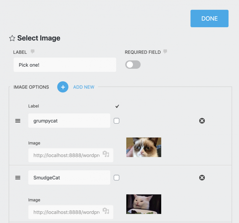
Select Image
The Select Image field is a list field that presents images as selectable list options. You can use any image from your Media Library as a list option. Users can make a single selection or multiple selections depending on your settings.
General Settings
- Label
- The name of the field as displayed to your users.
- Required Field
- If enabled, this field must be completed before the form can be submitted.
- Image Options
-
The options and values for the image fields.
- Add New
- Adds another option to the list.
- Label
- The name of the list option displayed to the user. The label will be pre-populated with the file name of the image, but can be changed.
- Calc Value
- When including this field in a calculation, the value entered here will be entered as a part of that calculation if the given list option is selected.
- Image
- Click the Media Library icon in this field to select an image from your Media Library that will display for this list option.
- “Check” column
- Whichever list option checked here will display as the default option to the user.
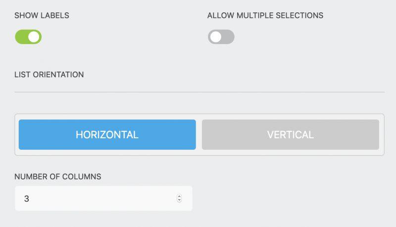
- Image Display Options
-
- Show Labels
- Show or hide the individual list options’ labels.
- Allow Multiple Selections
- If on (green), users can select 2+ list options instead of just 1.
- List Orientation
- Choose whether to display the image list options vertically (up/down) or horizontally (left/right).
- Number of Columns
- When Horizontal orientation is selected, this number determines the maximum number of columns the field will display images in. Depending on screen size (how much room actually exists to display from left to right) the field may display fewer columns than this setting.
Display Settings
- Description
- Any text entered here will appear between the label and the field.
Advanced Settings
- Multi-Select Box Size
- Sets the box height by the number of options shown at once.
Single Checkbox
The Single Checkbox field places a single checkbox on your form.
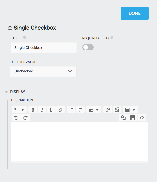
General Settings
- Label
- The name of the field as displayed to your users.
- Required Field
- If enabled, this field must be completed before the form can be submitted.
- Default Value
- Choose here whether the checkbox will be checked or unchecked by default when the user first views the form.
Display Settings
- Description
- Any text entered here will appear between the label and the field.
Checkbox List
The Checkbox List field allows for single or multiple checked selections.
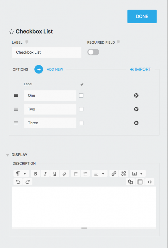
View the step-by-step tutorial here.
General Settings
- Label
- The name of the field as displayed to your users.
- Required Field
- If enabled, this field must be completed before the form can be submitted.
- Options
-
The options and values.
- Add New
- Adds another option to the list.
- Label
- The name of the list option displayed to the user.
- “Check” column
- Whichever list option checked here will display as the default option to the user.
Display Settings
- Description
- Any text entered here will appear between the label and the field.
Date/Time
The Date/Time field allows the visitor to select a day, month, year, and/or time from a standard calendar view.
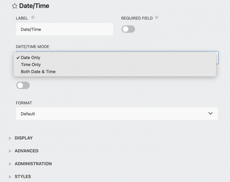
General Settings
- Label
- The name of the field as displayed to your users.
- Required Field
- If enabled, this field must be completed before the form can be submitted.
- Date/Time Mode
-
The date and time controls.
- Date Only
- Displays only the calendar view for selecting day, month, and year
- Time Only
- Displays only the selectors for hour, minute, and (if 24 hour input is not selected under Time Settings) AM/PM options.
- Both Date & Time
- Displays both date and time options for selection.
- Default to Current Date
- If enabled, the field will display the current date until a selection is made.
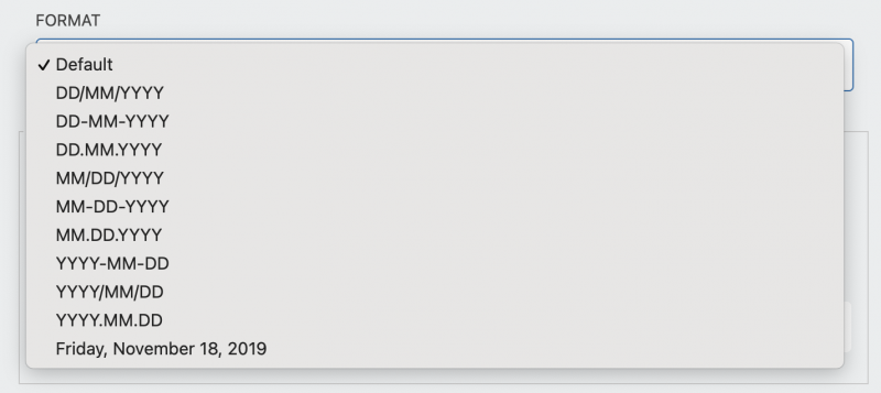
If disabled, the field will display blank until a selection is made. - Format
-
Choose the format the date presents in.
- Time Settings
-
This setting is visible only when Date/Time mode has selected Time Only or Both Date & Time
- 24 Hour Input
- Choose to display either the 24 hour clock when enabled or the 12 hour AM/PM clock when disabled.
- Minute Increment
- Set the number of minutes the selection is incremented by (i.e. every 15 minutes, every 30 minutes, etc).
Signature
The Signature field allows a form’s end user to provide a digital signature with the form submission. It supports both typed and drawn signatures.
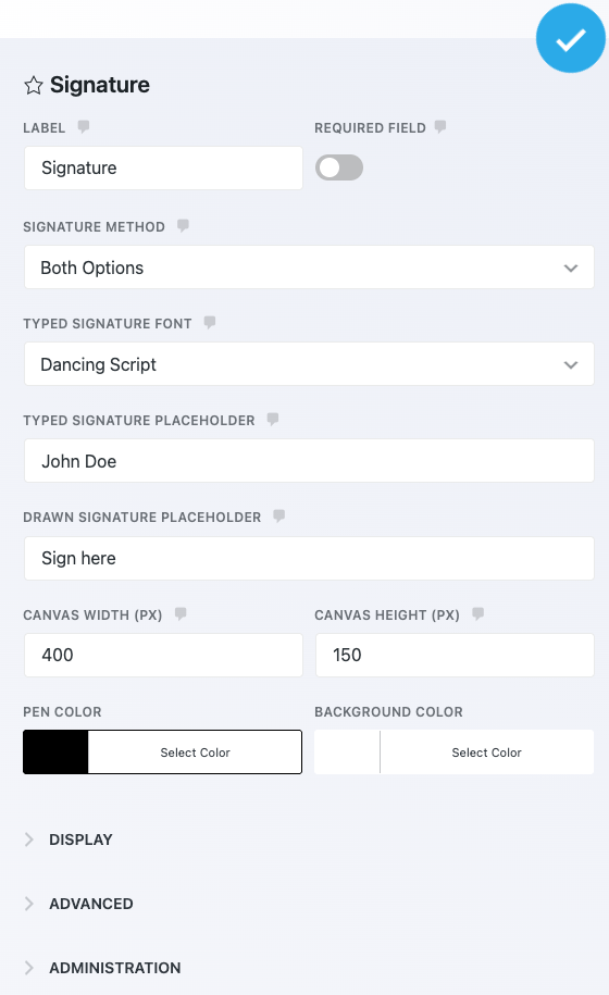
View the details here.
General Settings
- Label
- The name of the field as displayed to your users.
- Required Field
- If enabled, this field must be completed before the form can be submitted.
- Signature Method
-
Choose between the type of signature you want to collect.
- Typed
- Users can simply type their name and it will be rendered as a digital signature in your chosen font
- Drawn
- Users can manually draw their signature using their mouse, stylus, etc
- Both
- Users may select between either Typed or Drawn on the form
- Typed Signature Font
- Select the font that typed signatures are rendered in. This option is only visible if you have selected Typed or Both from Signature Method.
- Typed Signature Placeholder
- The value in this setting will appear as the placeholder for the typed signature. This option is only visible if you have selected Typed or Both from Signature Method.
- Drawn Signature Placeholder
- The value in this setting will appear as the placeholder text in the drawn signature canvas. This option is only visible if you have selected Drawn or Both from Signature Method.
- Canvas Width & Canvas Height
- Choose the display area in pixels for the drawn signature canvas.
- Pen Color & Background Color
-
Select the “ink” and background colors for the signature and signature background.
Note on Accessibility
Display Settings
- Help Text
- Entering text here will display an informational icon next to the field label. When a user hovers over it, a small window will appear containing this text.
- Description
- Any text entered here will appear between the label and the field.
Submit
Every form needs a Submit field. If you forget to add one, you’ll be prompted to do so when you Publish/save the form.
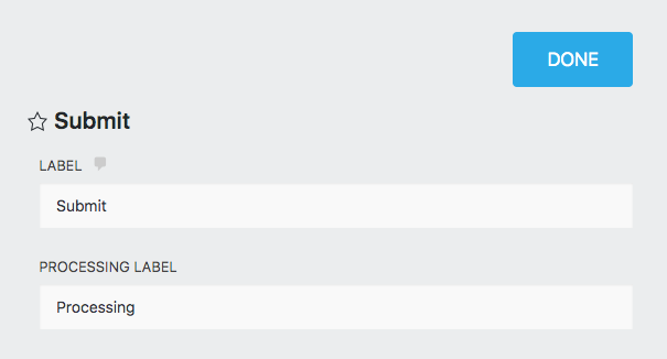
General Settings
Label
The name of the field as displayed to your users.
Processing Label
When the Submit button is pressed by a user, it will display “Processing” until the submission is complete. If you wish to change that language, you can do so here.
Address
The Address field is a Single Line Text field useful for entering street addresses. In addition to the default configuration for Single Line Text Fields, the Address field generates with the following additional properties:
- It has the Custom Name Attribute “address”
- It has the Autocomplete Attribute “address-line1”
- It is flagged as personally identifiable data by default
City
The City field is a Single Line Text field. In addition to the default configuration for Single Line Text Fields, the City field generates with the following additional properties:
- It has the Custom Name Attribute “city”
- It has the Autocomplete Attribute “address-level2”
The Email field is a Single Line Text field. In addition to the default configuration for Single Line Text Fields, the Email field generates with the following additional properties:
- It has the Custom Name and Autocomplete Attributes “email”
- It is flagged as personally identifiable data by default
- It enforces email address formatting
- The only permitted Restriction is Disable Browser Autocomplete
First Name
The First Name field is a Single Line Text field. In addition to the default configuration for Single Line Text Fields, the First Name field generates with the following additional properties:
- It has the Custom Name Attribute “fname”
- It has the Autocomplete Attribute “given-name”
- It is flagged as personally identifiable data by default
- The only permitted Restriction is Disable Browser Autocomplete
Last Name
The Last Name field is a Single Line Text field. In addition to the default configuration for Single Line Text Fields, the Last Name field generates with the following additional properties:
- It has the Custom Name Attribute “lname”
- It has the Autocomplete Attribute “family-name”
- It is flagged as personally identifiable data by default
- The only permitted Restriction is Disable Browser Autocomplete
Country
The Country field is a unique Select field. Unlike normal Select fields, the options list is pre-populated with a non-editable list of global countries which will appear in the user’s drop-down list when interacting with the field.
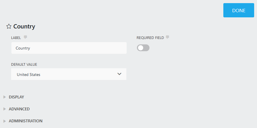
The Country field also includes the following General Settings:
Default Value
The field will load pre-populated with the country selected in the drop-down list.
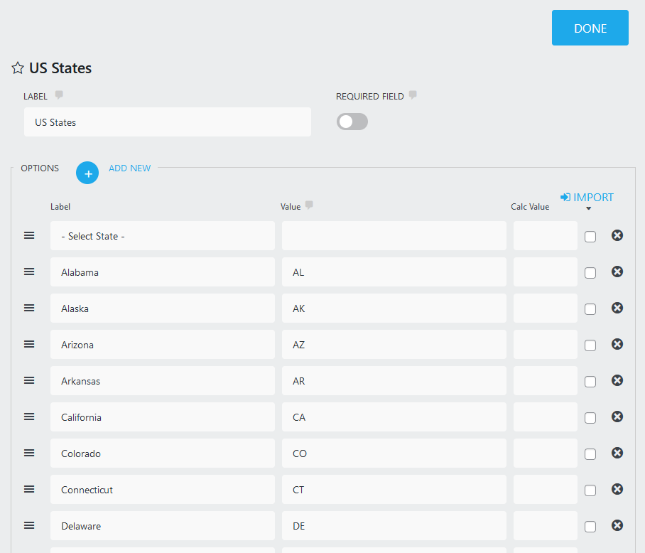
US States
The US States field is a Select field. The options list is pre-populated with a list of states within the United States which will appear in the user’s drop-down list when interacting with the field, along with a “Select State” option which can be set as default.
Phone
The Phone field is a Single Line Text field for use with telephone numbers. In addition to the default configuration for Single Line Text Fields, the Phone field generates with the following additional properties:
- It has the Custom Name Attribute “phone”
- It has the Autocomplete Attribute “tel”
- It is flagged as personally identifiable data by default
Zip
The Zip field is a Single Line Text field for use with zip (or postal) codes. In addition to the default configuration for Single Line Text Fields, the Zip field generates with the following additional properties:
- It has the Custom Name Attribute “zip”
- It has the Autocomplete Attribute “postal-code”
HTML
The HTML field will allow for the display of formatted text, links, and media anywhere on your form. Just place the field anywhere on the form, and whatever you have input into this field will display at that location. Contents of an HTML field will not display in submission data.
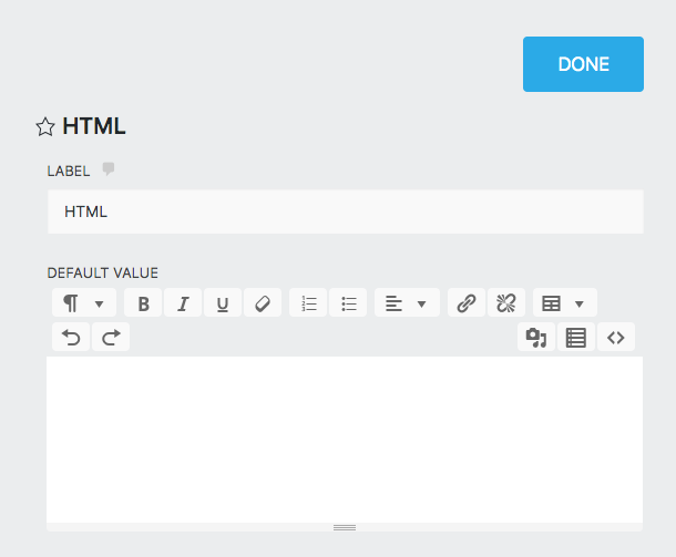
General Settings
Label
The name of the field as displayed to your users.
Default Value
Whatever is input here will display on the form wherever the HTML field is placed. Take advantage of the rich text editor to format text, create headers, display images, video, links and more.
Divider
The Divider field simply adds a horizontal line across the form wherever this field is placed. Use to divide a single page into clean sections.
Repeatable Fieldset
The Repeatable Fieldset, or Repeater, is a field type that you can drag and drop other fields into:
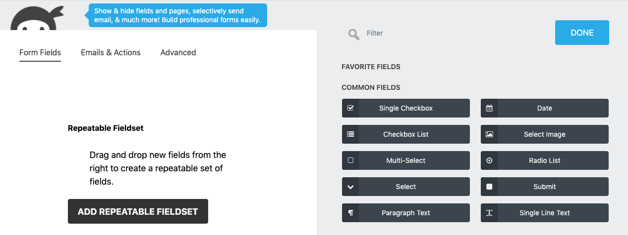
Note that fields can only be dragged and dropped into the repeater from the list of fields in the new field window at this time.
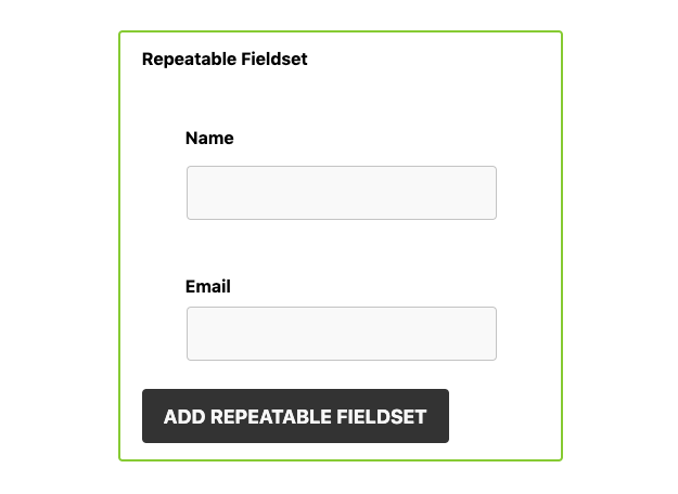
When a user views the form on the page, they will see all fields that you’ve placed inside the repeater as a group. Using an “Add” button, they can add as many groups of these fields as needed. The label of the repeater field and the text of the button can both be changed by adjusting the field’s Label setting.
For example, if you’re building an event registration form where the person submitting that form might want to add multiple guests, you might place a Name and Email field within the repeater. The user could then enter their own name and email, then press the Add button to also add the name and email of their first guess, again for their second guest, and so on.
Confirm
The Confirm field can be combined with any other field on your form to provide a way to validate the input into that field. Unless the Confirm field matches the chosen target field, the form will not submit. This can be used to confirm the entry of an email address, password, and other fields.
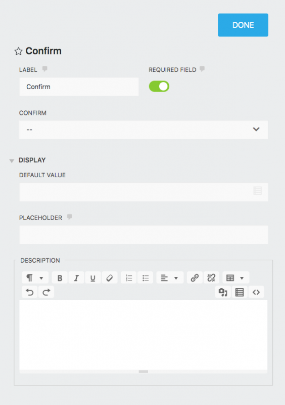
General Settings
Label
The name of the field as displayed to your users.
Required Field
If enabled, this field must be completed before the form can be submitted.This must be enabled for the validation feature to work.
Confirm
Select the field on the form you want the Confirm field to match/validate.
Display Settings
Default Value
The field will load pre-populated with any text entered as the Default Value. This setting supports the use of merge tags to display unique or custom values.
Placeholder
Any text entered here will appear in the field when the form loads, but disappear when the user starts typing in the field.
Description
Any text entered here will appear between the label and the field.
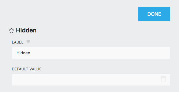
Hidden
The Hidden field does not display for users viewing the form. It can only be viewed from the form builder by a logged in administrator. Use this to store information that you want passed into submission data or sent along in an email, but not displayed to the user.
Please note if required fields are hidden, they are not going to be treated as required.
General Settings
Label
The name of the field as will be displayed in the Ninja Forms builder (not visible to users).
Default Value
The field will load pre-populated with any text entered as the Default Value. This setting supports the use of merge tags to display unique or custom values.
Number Field
The number field supports only numeric characters and comes with an up/down arrow for users to scroll through number values in designated steps.
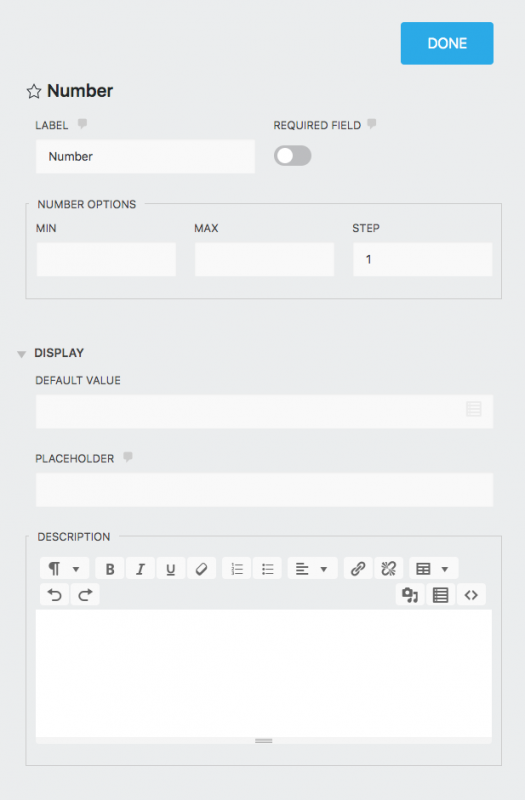
General Settings
Label
The name of the field as displayed to your users.
Required Field
If enabled, this field must be completed before the form can be submitted. This must be enabled for the validation feature to work.
Number Options
- Min: The minimum value that a user can enter into this field
- Max: The maximum value that a user can enter into this field
- Step: Restricts the values that can be entered into the field by the increment entered here. Example: Step = 1 will allow for 1, 2, 3, 4, 5, etc but not 1.5 or 4.3. Step = 10 will allow for 10, 20, 30, 40, 50, etc but not 15 or 43. Enter .01 here to allow for numbers like 9.99, 15.49, etc.
What is Scientific notation?
Scientific notation is the way that scientists easily handle very large numbers or very small numbers.
Display Settings
Default Value
The field will load pre-populated with any text entered as the Default Value. This setting supports the use of merge tags to display unique or custom values.
Placeholder
Any text entered here will appear in the field when the form loads, but disappear when the user starts typing in the field.
Description
Any text entered here will appear between the label and the field.
Recaptcha
The Recaptcha field links your form with Google’s reCAPTCHA technology, forcing a user to complete the reCAPTCHA challenge before the form can be successfully submitted.
For this field to work, you must link Ninja Forms to your Google account (see reCAPTCHA section). Failing to do this will result in a non-functional field.
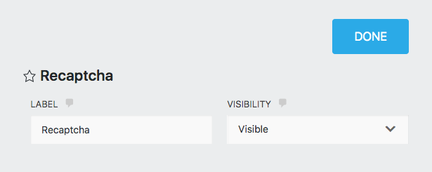
General Settings
Label
The name of the field as displayed to your users if you choose for the reCAPTCHA to be visible.
Visibility
Select whether to display an “I’m not a robot” field or to detect if the user is a robot in the background.
Anti-Spam
Challenge your users with a question that must be answered correctly in order for the form to be submitted.
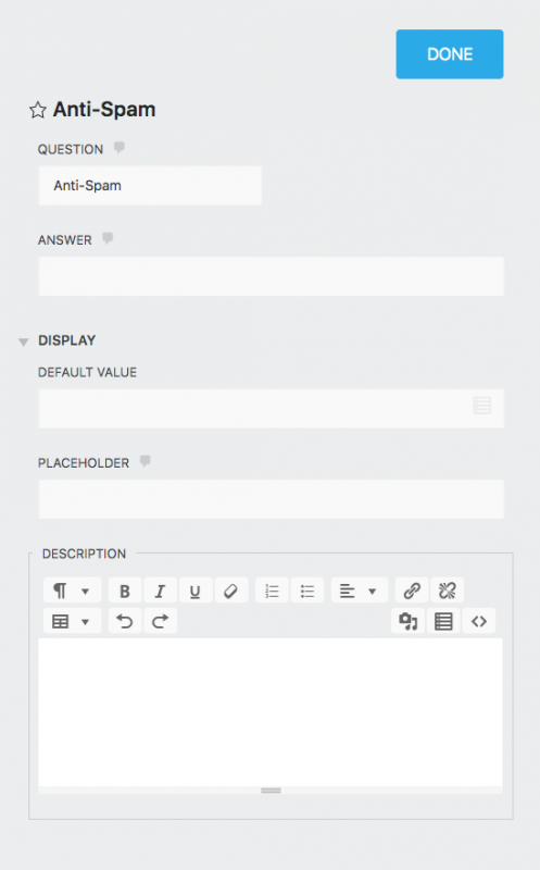
General Settings
Question
The question you want your users to answer in order to allow the form to be submitted.
Answer
The answer expected for the question setting. The users’ answer must match exactly. These are case sensitive.
Display Settings
Default Value
The field will load pre-populated with any text entered as the Default Value. This setting supports the use of merge tags to display unique or custom values.
Placeholder
Any text entered here will appear in the field when the form loads, but disappear when the user starts typing in the field.
Description
Any text entered here will appear between the label and the field.
Star Rating
The Star Rating field offers a “line-of-stars” graphic to the user, from which they can select a rating from a range of your choice.
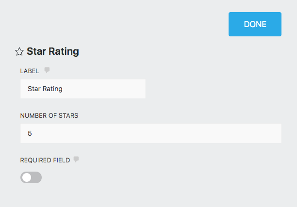
General Settings
Label
The name of the field as displayed to your users.
Number of Stars
The number of stars that will appear in your “line-of-stars” graphic.
Required Field
If enabled, this field must be completed before the form can be submitted.